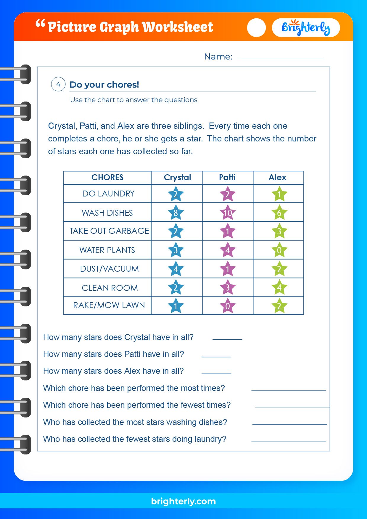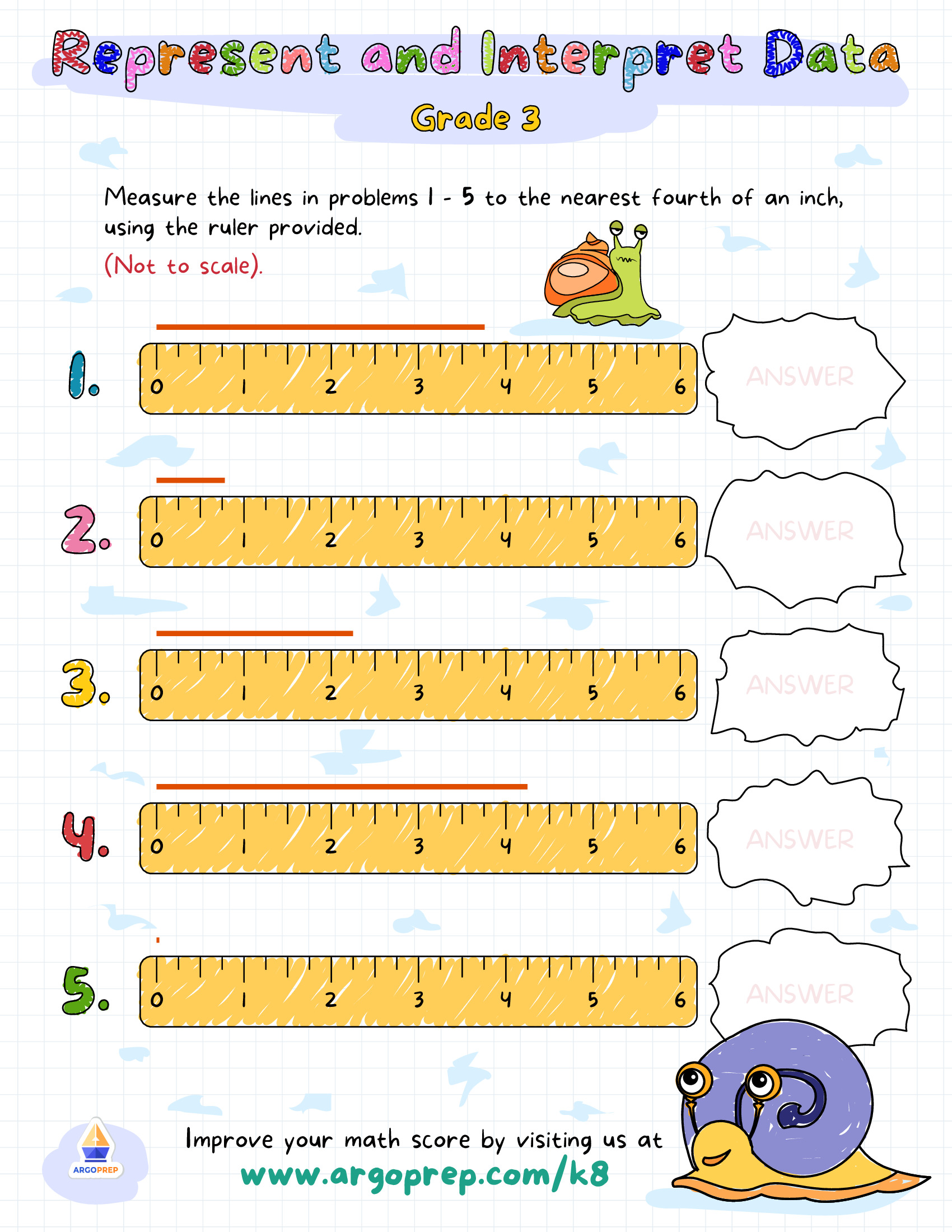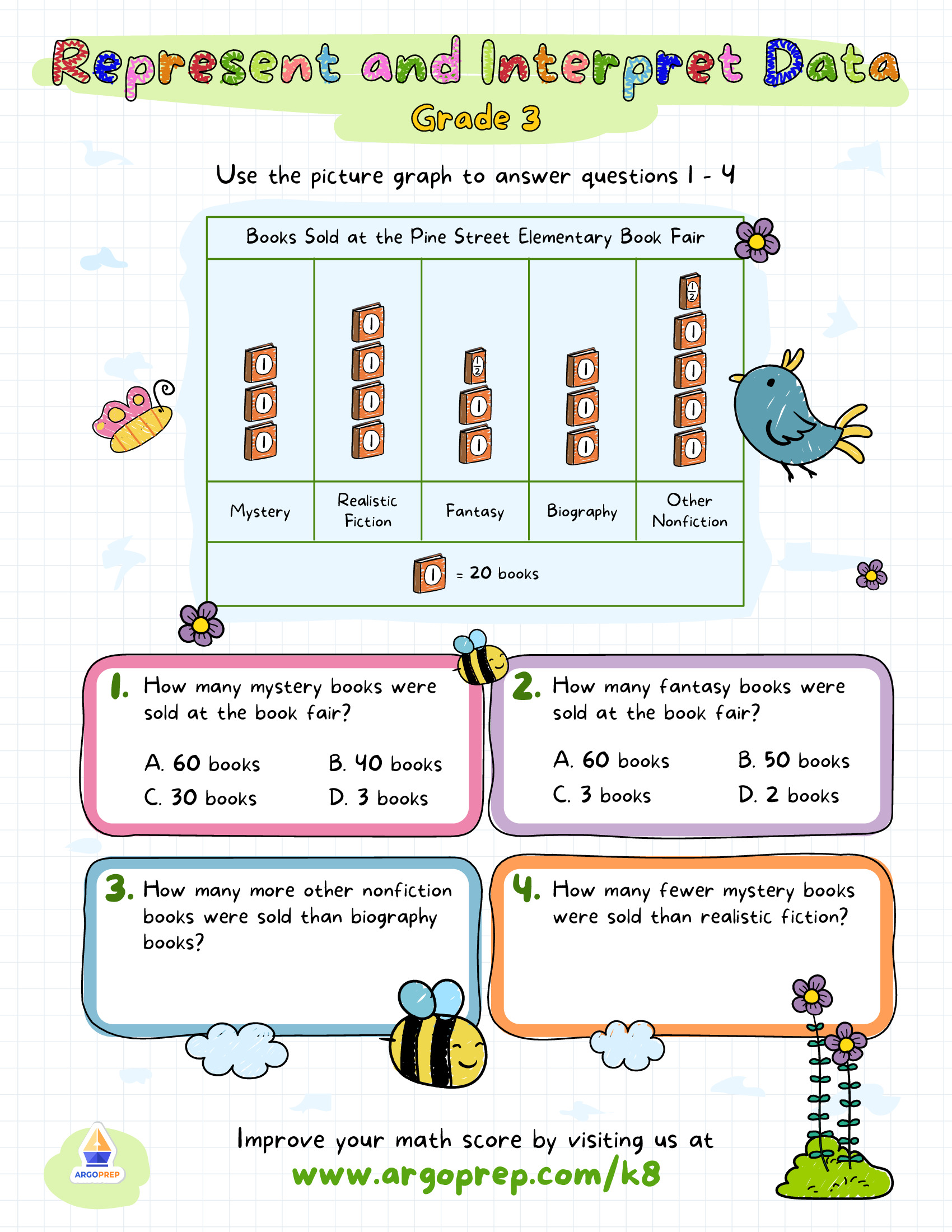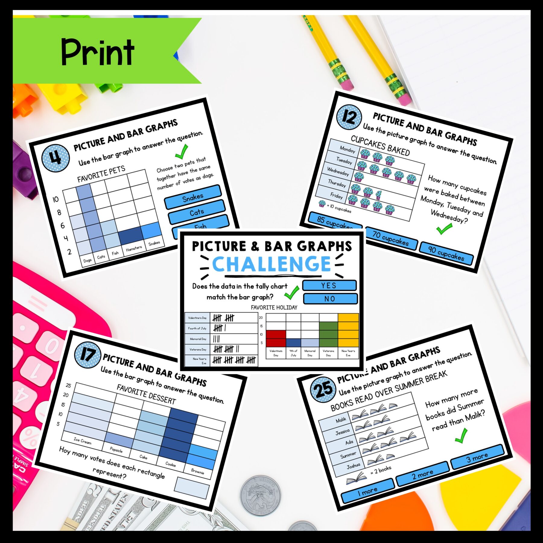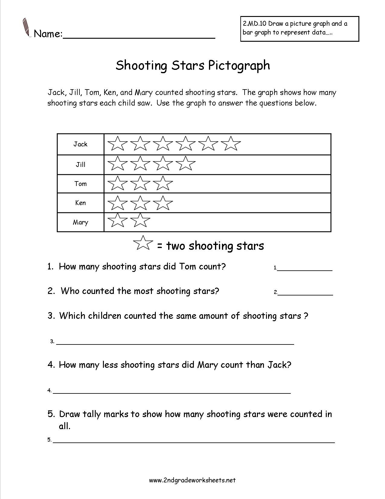
3rd Grade Graphing Worksheets offer a fun, hands‑on way for young students to turn raw numbers into visual stories. They bridge the gap between simple counting and the analytical skills teachers want to see. In this guide, I’ll walk you through why these worksheets are essential, how to pick the right graph type, step‑by‑step creation tips, and ways to keep learners excited. Ready to make math a visual adventure? Let’s dive in.
Why 3rd Grade Graphing Worksheets Matter

At this age, children are transitioning from memorizing facts to making connections. Graphing helps them see patterns, compare data sets, and develop reasoning skills. When students plot their own data, they practice precision with numbers and learn how to ask questions like “Which group had the highest count?” or “What trend emerges over time?” These worksheets also give teachers a quick diagnostic tool to spot misconceptions before they become habits.
Choosing the Right Type of Graph
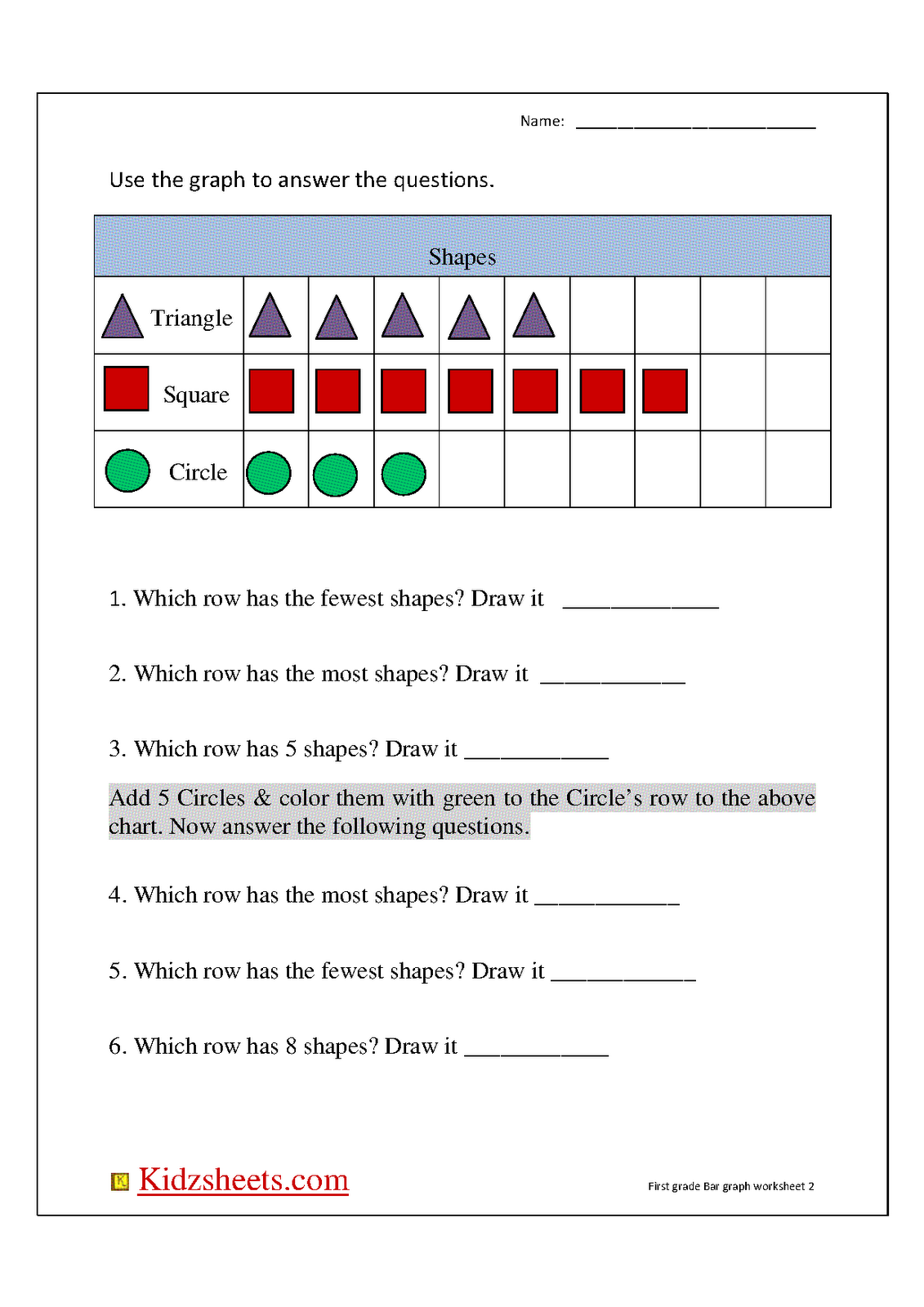
Not every data set deserves a bar graph. Selecting the appropriate visual format depends on the question at hand, the number of categories, and the age‑appropriate complexity.
Bar Graphs
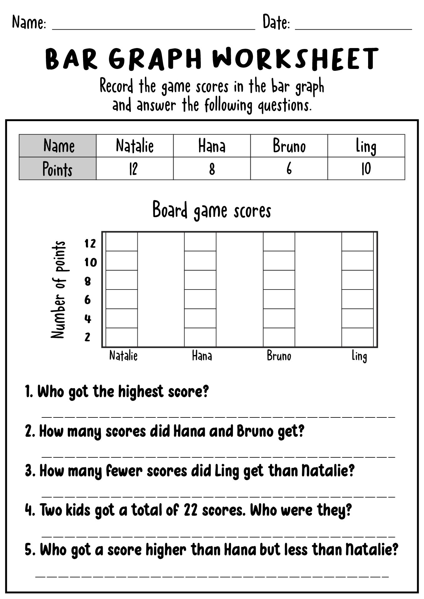
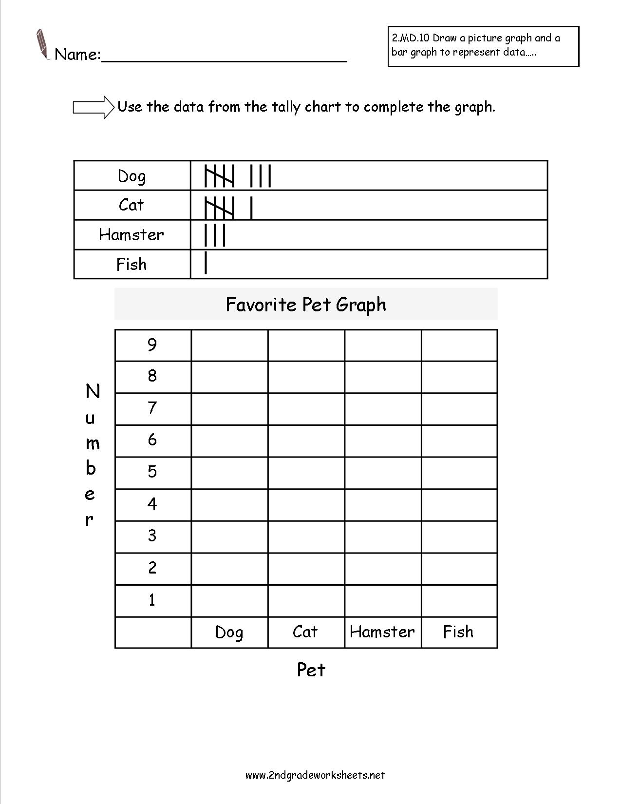
Bar graphs are the most common choice for 3rd graders because they handle categorical data nicely. Students can easily see differences in height, making comparisons intuitive. They also allow for color coding, which keeps the activity engaging.
Line Graphs
Use line graphs when you want to show changes over time—like tracking the number of books read each month. The continuous line encourages students to spot trends and discuss whether a value is rising, falling, or staying steady.
Pie Charts
Pies illustrate portions of a whole. They’re best for data sets with a limited number of categories, such as the types of pets owned by classmates. Students learn to calculate percentages and think about proportional relationships.
Column Graphs vs. Bar Graphs
Column graphs are the vertical counterpart to bar graphs. When screen space is limited, or you’re using a projector, columns fit better. The learning objectives remain the same; it’s merely a matter of orientation.
Step‑by‑Step Guide to Creating a Bar Graph Worksheet
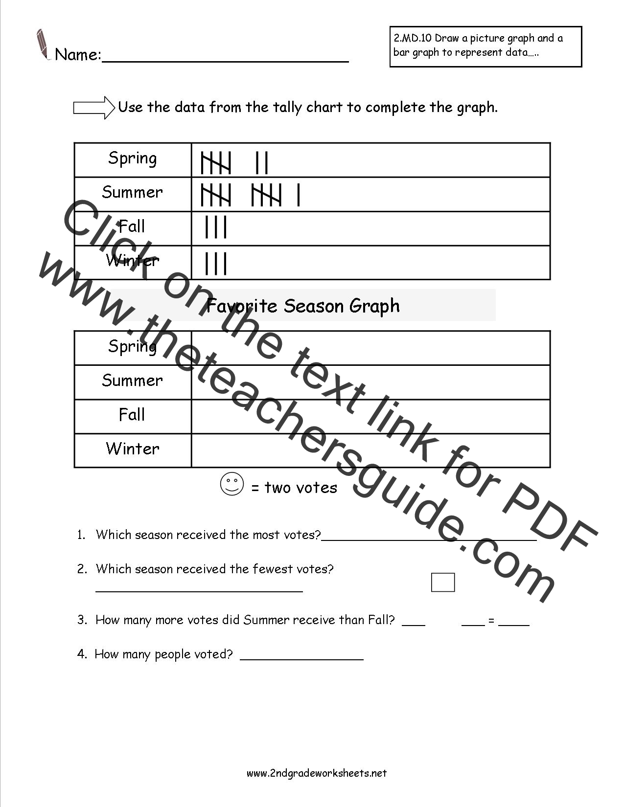
Here’s a practical recipe that ensures consistency and clarity.
Gather Data
Start with a simple question that students can answer through observation or simple research. Example: “How many apples, bananas, and oranges were sold at the school bake sale?” Provide a small data set or let them collect their own numbers. Keep the range small—ideally between 5 and 15 items—to maintain focus.
Prepare the Graph Template
Create a clean grid with labeled axes. On the X‑axis list the categories (apples, bananas, oranges). On the Y‑axis, set incremental markers (1, 2, 3, etc.). Include a clear title, such as “Fruit Sales at the Bake Sale.” Use a bold, readable font and plenty of white space to avoid clutter.
Labeling and Scales
Ensure the Y‑axis labels are evenly spaced and that the scale starts at zero. Avoid misleading graphs by keeping the scale consistent across worksheets. You can add a subtle color palette—light blue for bars and a darker shade for the borders—to enhance readability.
Student Instructions
Provide concise steps: 1. Write the numbers beside each category. 2. Draw a rectangle that matches the height of the number. 3. Color the bar. 4. Label the top of each bar with its exact number. Keep the language simple and break the steps into bullet points so students can reference them easily.
Grading Rubric
Develop a short rubric that covers accuracy, neatness, correct labeling, and interpretation. For example, 2 points for accurate bar height, 1 point for proper labeling, 1 point for a short written explanation of which fruit sold most.
Engaging Activities to Keep Students Interested

Graphing can become repetitive if students see only worksheets. Spice things up with real‑world data and interactive tasks.
Real‑World Data Projects
Ask students to collect data from their homes—count the number of books on each shelf, tally the colors of crayons, or record how many minutes they play outside each day. This hands‑on approach turns abstract numbers into tangible experiences.
Interactive Digital Tools
Incorporate tablets or classroom computers with simple graphing programs. Students can drag bars, adjust colors, and instantly see their changes reflected. Digital tools also allow for instant feedback and can embed auto‑grading features.
Peer Review Sessions
After completing a worksheet, have students swap graphs and assess each other’s work. They should look for correct bar heights, clear labels, and logical interpretations. Peer review encourages critical thinking and collaborative learning.
Common Pitfalls and How to Avoid Them
Even with a clear template, errors can sneak in. Address these early.
Mislabeling Axes
Students often forget to label the X‑ or Y‑axis or use vague titles. Reinforce the importance of clear labeling by modeling a sample graph and walking through each label.
Skewed Data Representation
Starting the Y‑axis at a number other than zero can exaggerate differences. Demonstrate both correct and incorrect scales in class, showing how the visual can mislead.
Overcomplicating Graphs
Adding unnecessary lines, colors, or decorative elements can distract from the data itself. Keep the design minimal: bold bars, simple labels, and a straightforward title.
Printable vs Digital Worksheets: Pros & Cons

Both formats have unique advantages that can cater to different classroom setups.
Printability
- Pros: Easy to hand out, no need for devices, students can physically color and cut bars.
- Cons: Limited space on paper, less flexibility for modifications once printed.
Digital Platforms
- Pros: Interactive elements, automatic grading, easy to share, adaptable for different learning speeds.
- Cons: Requires devices and reliable internet, potential technical glitches, may distract from the core task if not managed.
Assessing Understanding Through Graphs

Testing comprehension goes beyond checking the accuracy of the graph. It involves interpretation and application.
Question Types
Use a mix of multiple‑choice, short answer, and open‑ended questions. For example: “Which fruit had the highest sale? Explain why the bar is the tallest.”
Interpretation Skills
Encourage students to describe trends or make predictions. Ask them what would happen if the number of bananas increased by two. This deepens analytical thinking.
Integrating Graphing into Curriculum
Graphing isn’t isolated; it supports broader learning goals.
Math Standards
Link worksheets to standards that cover data analysis, measurement, and probability. Demonstrating how graphs illustrate these concepts reinforces the curriculum.
Cross‑Curricular Connections
Use graphing in science (e.g., tracking plant growth), language arts (analyzing character traits across chapters), or social studies (population data). This shows students that data visualization is a universal skill.
Resources for Teachers

Finding the right materials can save time and boost effectiveness.
Free Templates
Look for downloadable PDF templates that come with pre‑labeled axes and color‑coded bars. Many educational websites offer printable worksheets that can be adapted quickly.
Professional Development
Attend workshops or webinars that focus on data literacy. Sharing best practices with peers can inspire fresh ideas for incorporating graphs into daily lessons.
Final Thoughts

3rd Grade Graphing Worksheets are more than just assignments; they’re stepping stones toward critical thinking, data fluency, and lifelong learning. By selecting the right graph type, providing clear templates, engaging students with real data, and avoiding common mistakes, teachers can turn simple numbers into powerful visual stories. Embrace both printable and digital options, assess not just accuracy but interpretation, and weave graphing across subjects for a richer classroom experience. With these strategies, you’ll help your students not only plot bars but also chart their own paths to analytical confidence.